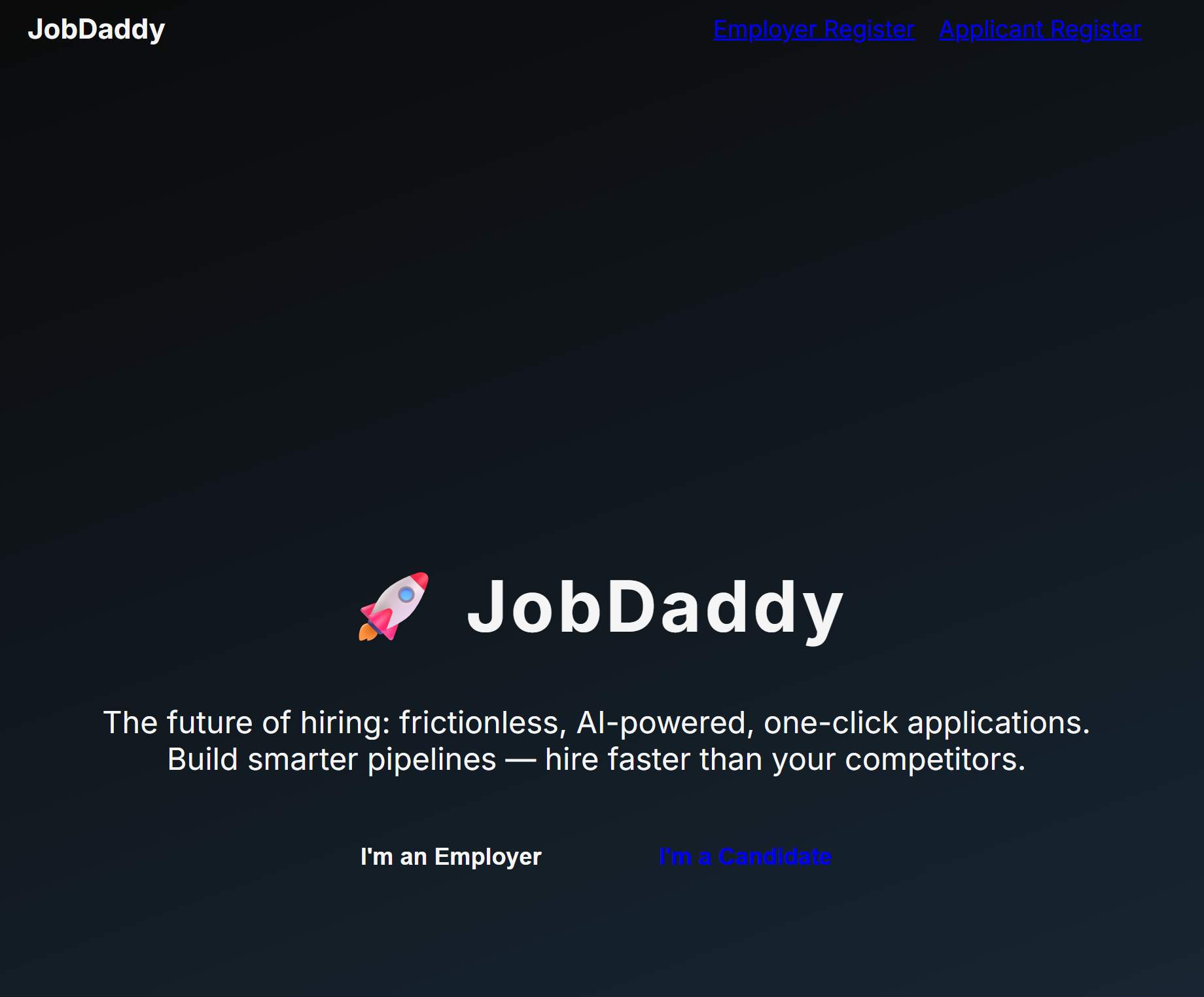
Smart Application Platform
UX Design • 2025 • Personal Project
Overview
A streamlined platform to simplify the job application process for users frustrated by repetitive form-filling and clunky ATS interfaces.
Role: Developer & Designer
Tools: Figma, React, HTML, CSS, JavaScript
Problem
Job seekers often feel overwhelmed by disjointed application processes, especially when filling in the same details repeatedly. Existing job boards prioritize recruiters, not applicants—leading to burnout, confusion, and abandonment. Many users give up mid-form, especially on mobile, due to poor layout and unclear progress.
My Approach
Discovery: Interviewed recent graduates and job switchers to identify common friction points in application flows Synthesis: Mapped user journeys and identified pain clusters around form repetition, lack of preview, and mobile usability Ideation: Sketched alternative flows and form structures using FigJam Prototyping: Created interactive Figma prototypes and tested with 5 users, iterating based on feedback UI Design: Built responsive desktop and mobile layouts focused on clarity, flow, and emotional reassurance
UX Decisions
- Simplified multi-step layout reduces cognitive load and maintains motivation
- Progress tracker reinforces completion momentum and reduces form abandonment
- Smart field memory feature recalls previously-entered data across forms
- Dark mode toggle & larger tap targets improve accessibility
- Designed for WCAG 2.2 compliance, with clear color contrast and keyboard navigation support
Final Build
Currently in development using React and styled-components. Form logic and user flow models completed in Figma.

Reflection
This project taught me how emotionally draining a poorly designed flow can be—and how much UX can reduce that friction. I’m proud of how I translated user frustrations into real, testable improvements. If I could do it again, I’d prioritize backend structure earlier to validate form-saving logic. Still, this project reminded me why I love designing for clarity and confidence.