EPA Water Contamination Dashboard
UX Design & Data Visualization • 2025 • Data Science Final Project
Overview
A public dashboard to visualize drinking water contamination levels across New Jersey using EPA and EWG datasets, designed for accessibility and community awareness.
Role: UX Designer & Data Analyst
Tools: Tableau, Python (pandas), Excel, Figma, Jupyter Notebook
Problem
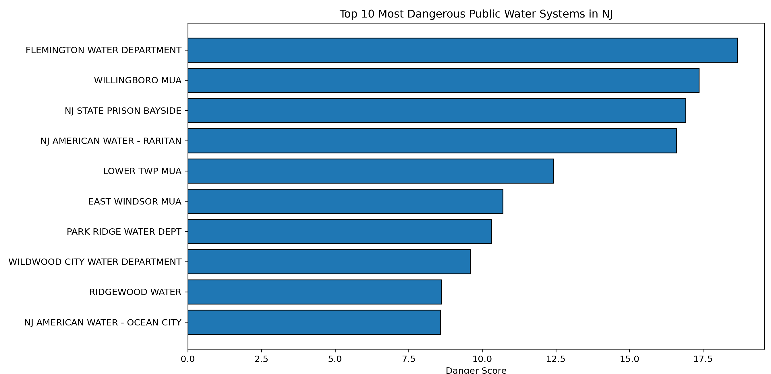
Information about water quality is publicly available—but not understandable. The EPA’s UCMR5 and EWG datasets are fragmented, messy, and hard for the average person to interpret. We wanted to help people in New Jersey understand what chemicals are in their water, how serious they are, and how their town compares—all in one place.
My Approach
- Data Wrangling: Cleaned and merged two major public datasets (EPA UCMR5 + EWG contaminant records), aligning chemical identifiers and utilities across systems
- Custom Metrics: Developed a “danger score” using health-based contaminant thresholds to normalize values and simplify comparisons
- User Research: Interviewed non-technical friends and community members to gauge water safety concerns and test terminology
- Prototyping: Built a mobile-friendly dashboard using Tableau with region filters, chemical lookups, and utility comparisons
- Visual Design: Created clean, color-coded layouts that emphasized clarity, safety levels, and region-based storytelling
UX Decisions
- Simplified risk visualization using a custom score system (1–10) rather than raw PPM values for public clarity
- Interactive region selector helps users easily see their own area without digging through lists
- Searchable contaminant index with plain-language names and health context for each chemical
- WCAG-aligned contrast and labeling ensure accessibility for colorblind and screen reader users
- Hover-based explanations for “danger score” and chemical standards improve transparency without crowding the layout
Final Build
Tableau dashboard built and published for public access Python (pandas) used to clean, join, and score datasets Layouts and interactions prototyped in Figma prior to dashboard construction
Reflection
This project taught me the value of designing with empathy, not just data. The scientific complexity behind water safety needed translation—and I was proud to be the one to bridge that gap. If I were to iterate, I’d add filtering by vulnerable populations and more support for multi-lingual access. But as a first public-impact project, this was incredibly rewarding.